
Redend Point - Sherwin Williams Color of the Year
Sherwin-Williams announces their color of the year to be Redend Point, a blush-beige that brings in warmth and expands how we see neutrals. "The color is a natural choice for those looking for a warm and joyful neutral in both interiors and exteriors,” Sue Wadden, director of color marketing at Sherwin-Williams states, “A neutral doesn’t necessarily have to be white, beige, or gray; it can be a color or have colorful undertones, such as pink.”

Photo by Sherwin Williams
The inspiration behind Redend Point was discovery, exploration, and expanding our world connections. “Redend Point was inspired by the idea of finding beauty beyond ourselves. It is a heartening hue that invites compassion and connection into any space” Wadden says. The world has been through a lot the past few years and this color represents the need to provide compassion and care for ourselves and others.


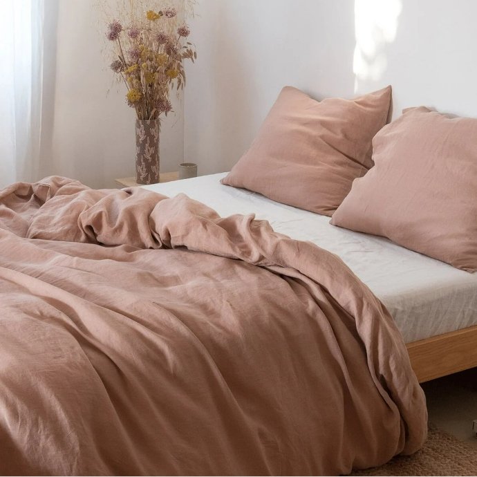
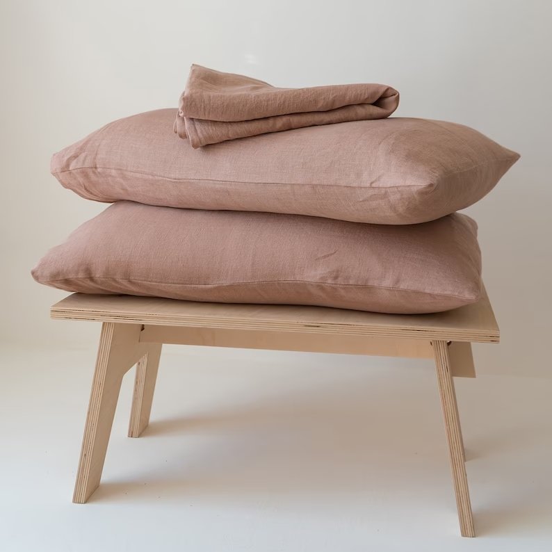
Dusty pink undertones bring out the earthiness of Redend Point, which makes it a great color to pair with natural looking textiles and layering with organic material such as wood, stone, and clay. This color adds warmth and a sense of peace in the home, while being subtle enough to bring into a minimal style, without overwhelming the space.
Redend Point is a great color to include in your coastal design by breaking up some of the blues & creams that are often the focus. Including a hint of a warmer neutral, with pink undertones as can emphasize a welcoming environment and a calming energy you want your home to have. Natural elements, commonly found in coastal design, such as mango wood, rattan, and jute can also be highlighted by pairing them with Redend Point.
This color is neutral enough to paint an entire room without it overpowering the space, but still vibrant enough to include as an accent color on walls, decor, and furniture.

We are noticing design is continuing towards a path where nature is a strong influence on our interiors, which you can see in our past design like Subtly Coastal, especially in the abaca rope chairs. Redend expresses just that with its warm, pink undertones that are remincent of exploration and compassion. We anticipate most companies choosing other warm toned colors that bring us back to nature and create a relaxing environment.

Photo by Sherwin Williams
If you are looking to include the color of the year, Redend Point, into your home Sherwin Williams reccomends to pair it with Kestrel White, Polite White, and Canyon Clay.
